
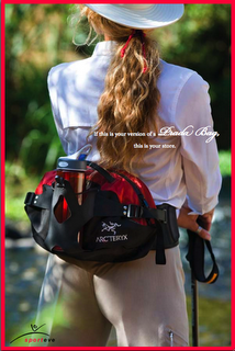
Mr. Hall over at Adrants forwarded me a tip he received about some ads created for a high end women's athletic boutique in LA. Overall, I'm unimpressed to say the least. If this ad was in a magazine, I'd flip right past it after having a long, soothing mental rant about typography.
Mmm... typography rants. The creative, in its entirety, should never have seen the light of day. The concept, the typography, the red border, the photography, and the layout are awful and it looks like there wasn't much thought put into any of it. The typography was raped and beaten by the designer to the point that it was to be forever scarred. Take note, blossoming typographers, those little serif fonts can't hold a damn weight against the photography and reading-wise, it's best to avoid white type unless it's a bold short headline. I think they probably paid next-to-nothing for all of the creative and that's what they got plus a throw back to the 90's.

Search

Categories
Archives
- November 2008
- August 2008
- July 2008
- June 2008
- May 2008
- April 2008
- March 2008
- February 2008
- January 2008
- December 2007
- November 2007
- October 2007
- September 2007
- August 2007
- July 2007
- June 2007
- May 2007
- April 2007
- March 2007
- February 2007
- January 2007
- December 2006
- November 2006
- October 2006
- September 2006
- August 2006
a nod and a wink
Powered by
Movable Type Open Source 4.1
Movable Type Open Source 4.1

Leave a comment